A chat with Sonia

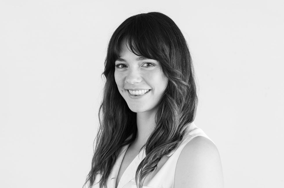
Need a typographic, infographic, super-fantastic designer to collab with? Come join us as we chat with Sonia about her journey into design, the challenges and triumphs that come with the job and where the industry is heading.
What got you into design?
Growing up, I’d paint, draw and make really intricate birthday cards for people. When it came time to not be at school, I was deciding between a bunch of different things but was interested in studying design further, so I applied to study at Massey. I got in, and became a designer after that. I haven't regretted it yet, so that's good.
What do you enjoy most about your role?
I enjoy piecing together different parts of the story, and the overall narrative we are trying to tell. It’s finding the threads, tying them together and telling a story in a way that feels authentic, interesting or unique. That's what I love most.
What do you find most challenging?
The fear of the blank page. You get to a point in a process where you've done a lot of thinking, strategising, and researching - then it comes to the doing. It's kind of like a false start. I find the fix is just to get ideas out and the ball rolling. It’s about pushing forward rather than tripping over yourself before it's even begun.
What do you think clients get out of working with a design studio?
Working together offers a different way of thinking about things. Businesses are so focused on the operational side of things that there is often not really time to consider branding. We can bring a fresh perspective on how your audience understands and interacts with your business. It’s about highlighting the truths that have been in front of the business all along which they might not have had the time, agency or space to uncover.
What project are you most proud of?
The concussion campaign for New Zealand Rugby. It started with a tight timeline and budget, but with a pretty meaty problem – bringing awareness to concussion and its recovery process. I loved diving into the problem from an audience perspective and uncovering the insight that concussion is an invisible injury. Based on that, we set out to make it something impossible to be ignored. This idea informed all of our design decisions, media placements and activations. It was quite challenging but also quite creative.
What are your favourite things we do in the studio?
I really like Assembly. It’s a chance every month to reflect on and celebrate the awesome work we've all done. It’s a chance to get together, do something fun or silly (or both), and sometimes have a costume thrown in the mix. It’s nice to have a good time and just let off some steam. It's not forced fun - we all get along, so that's good.
What philosophy underpins your approach to design?
Have some fun with it! Even if the subject matter is complex, serious or heavy, I think having a sense of play or considering an unconventional approach to a problem is always going to be a useful tool. There's a lot of seriousness in the world, so I think it's worth taking any opportunity to break out of that and bring some joy. For me, it’s about thinking off the beaten track or tapping into pop culture references from my corner of the Internet. It's really rewarding to work in that way, and equally rewarding for audiences to experience.
What’s your go-to design hack?
I get a lot of inspiration from nostalgic design archives so pulling on some of those references is always a good hack. Whether it’s adding a bit of texture, grain fun, or interesting color palettes - that seems to get me unstuck.
You recently undertook the 36 days of type challenge. What did you learn?
Building discipline, so that you don't have to rely on motivation was a really big one for me. When it was 9:30 at night and I really didn't want to draw things - the structure forced me to be consistent. Doing the work and putting it out in the world has also been amazing. Mainly, it makes you part of a community: by participating you find all these amazing lettering artists and designers that are doing the same thing but in their own way.
What’s your favourite infographic?
We Are Here, An Atlas of Aotearoa by Chris McDowall, and Tim Denee. It covers anything and everything from nature to patterns to money to music to where people live. What I love most about it is you can turn to any page and learn something really interesting about New Zealand. Each page covers a complicated issue but simplifies it without removing too much context. It tells a story about Kiwis, what they do and how they interact with space or place.
How do you see the design industry changing in the next 5-10 years?
I think it will be about elevating the importance of diversity. Diversity of thought, diversity of people/cultures, and diversity of needs/solutions that we encounter as well as provide. Related to that, is the empowerment of more women in the creative industry, leading to them being represented in industry leadership positions. Currently, only 1% of the world’s creative studios are owned by women, so I'd love to see that change to offer more pathways and opportunities across the board.
-
Currently…
What's your favourite font? Anything from Oh No Type Co.
What's your favourite colour? An aggressive, bold green.
Listening to A lot of Labrinth.
Reading Shoe Dog. The first sentence is great.
Watching The NBA playoffs.
Dreaming of? Mexico. With tequila in one hand and street tacos in another.
Obsessing over? How to draw letters better.
Fav walk? Mount Taranaki summit.
