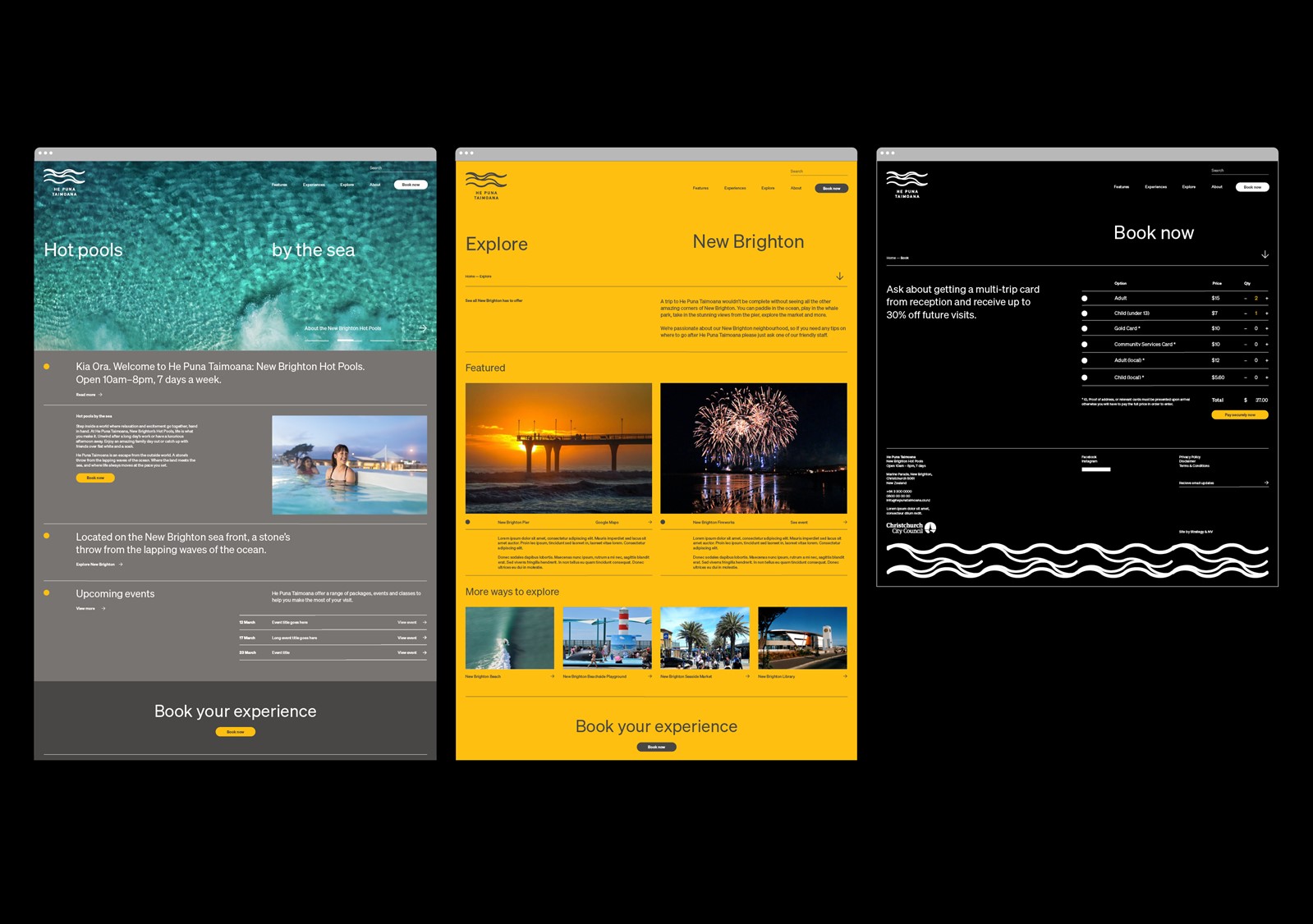
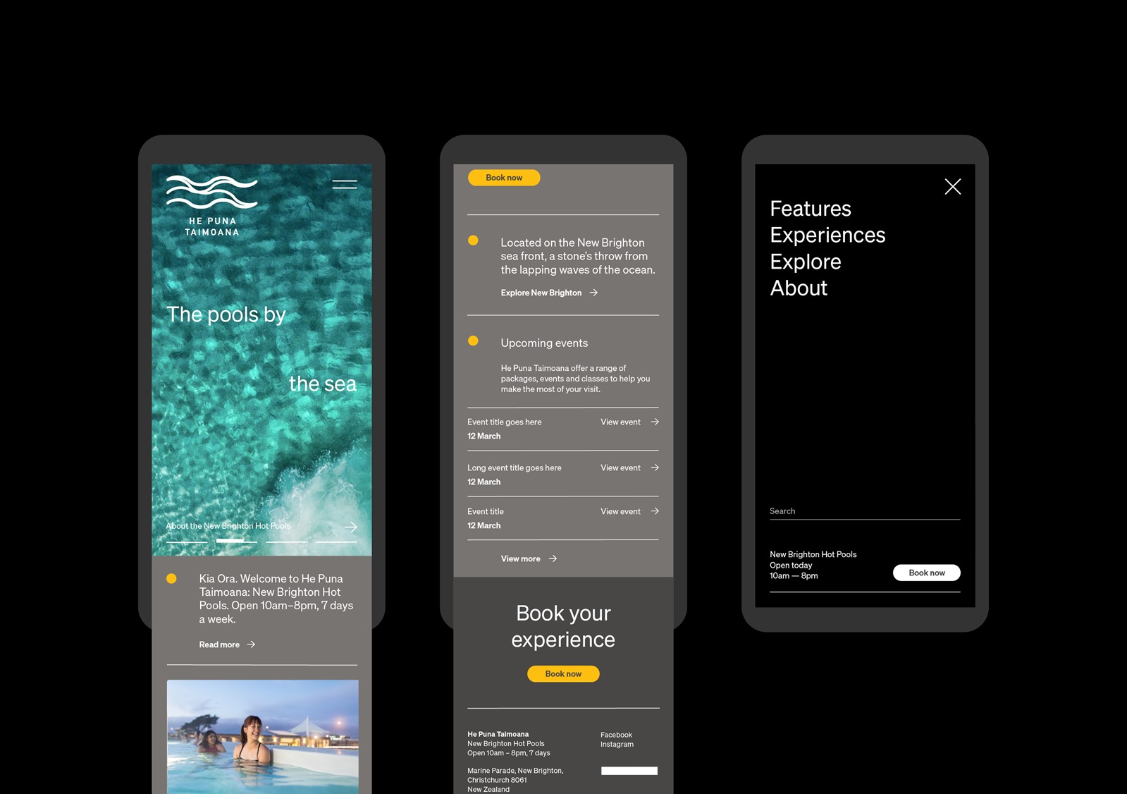
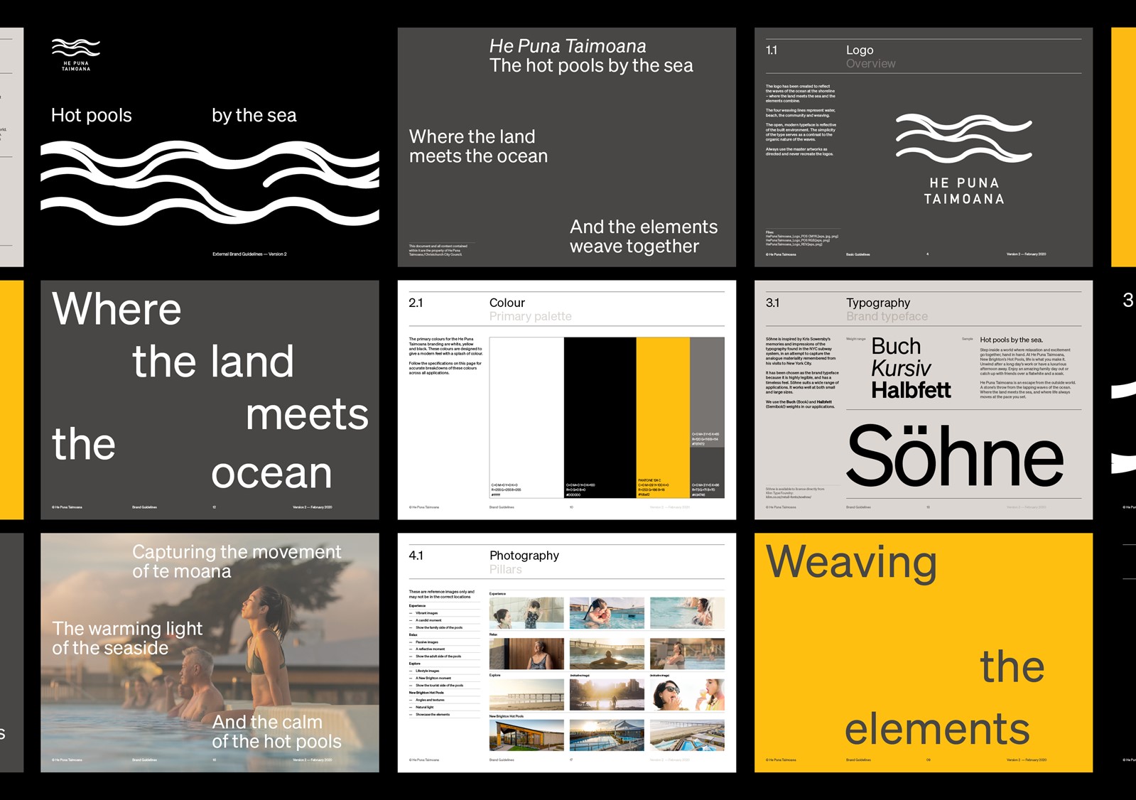
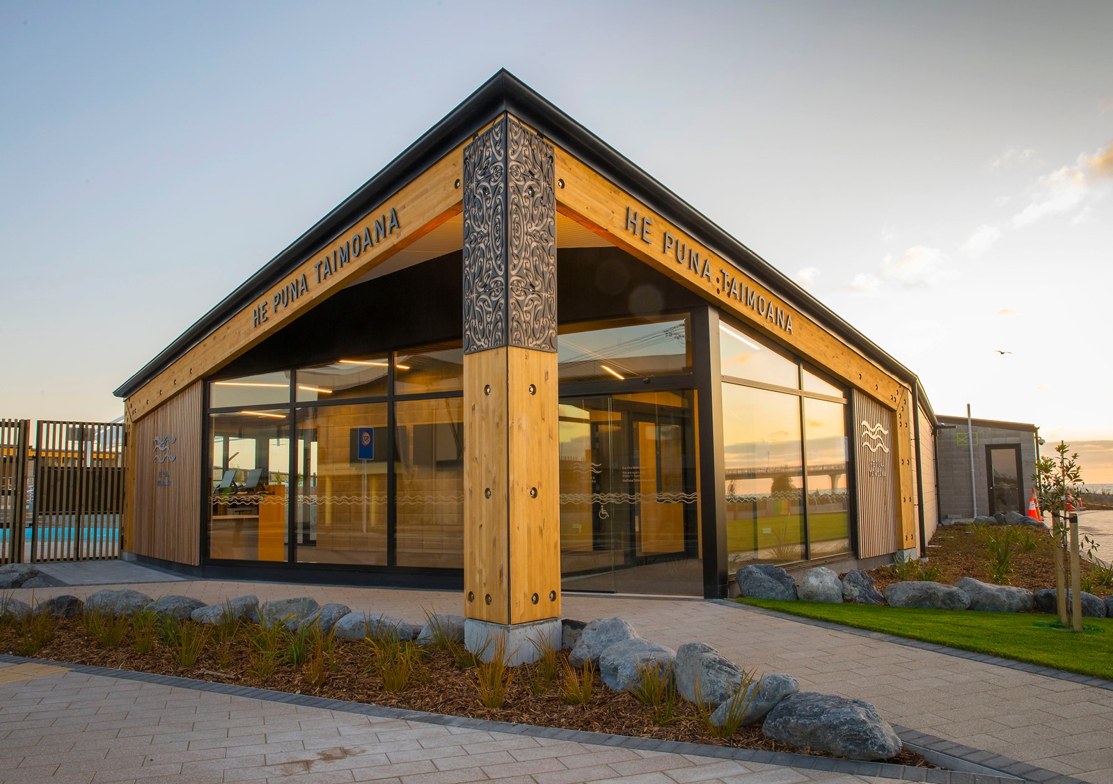
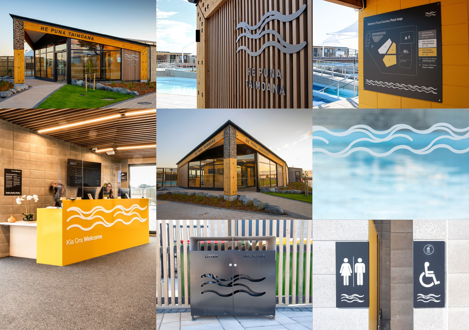
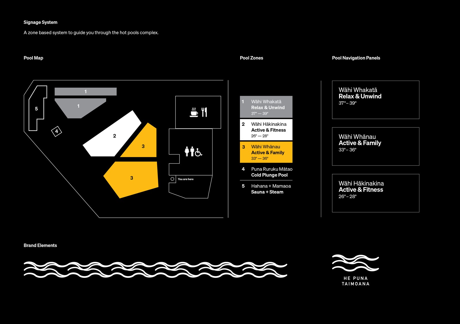
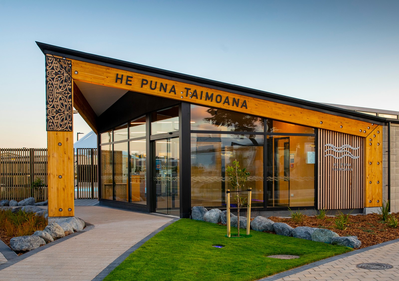
"An identity embraced by the hot pools — they made the logo 60ft wide on the beach, weaved it throughout the new building & made it the cornerstone of their signage system."
The new Hot Pools is a key part of the wider New Brighton Regeneration Project. The people and communities of New Brighton were consulted throughout the branding process. Matapopore developed a cultural narrative for the New Brighton Regeneration Project as well as the cultural design intent for the Hot Pools. He Puna Taimoana (the pools by the sea), was the name gifted to the project by Matapopore Trust. We commissioned research to provide us with important insights of our key audiences and integrated this as we created a dramatic and uplifting brand story for He Puna Taimoana that wove together our bicultural history, the physical place, and elemental feel of the location to introduce and connect this exciting complex to the region.
Execution
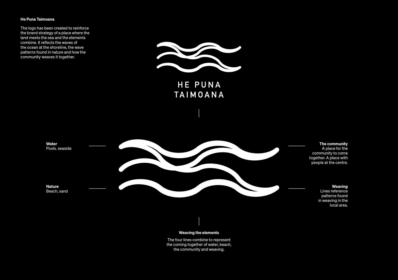
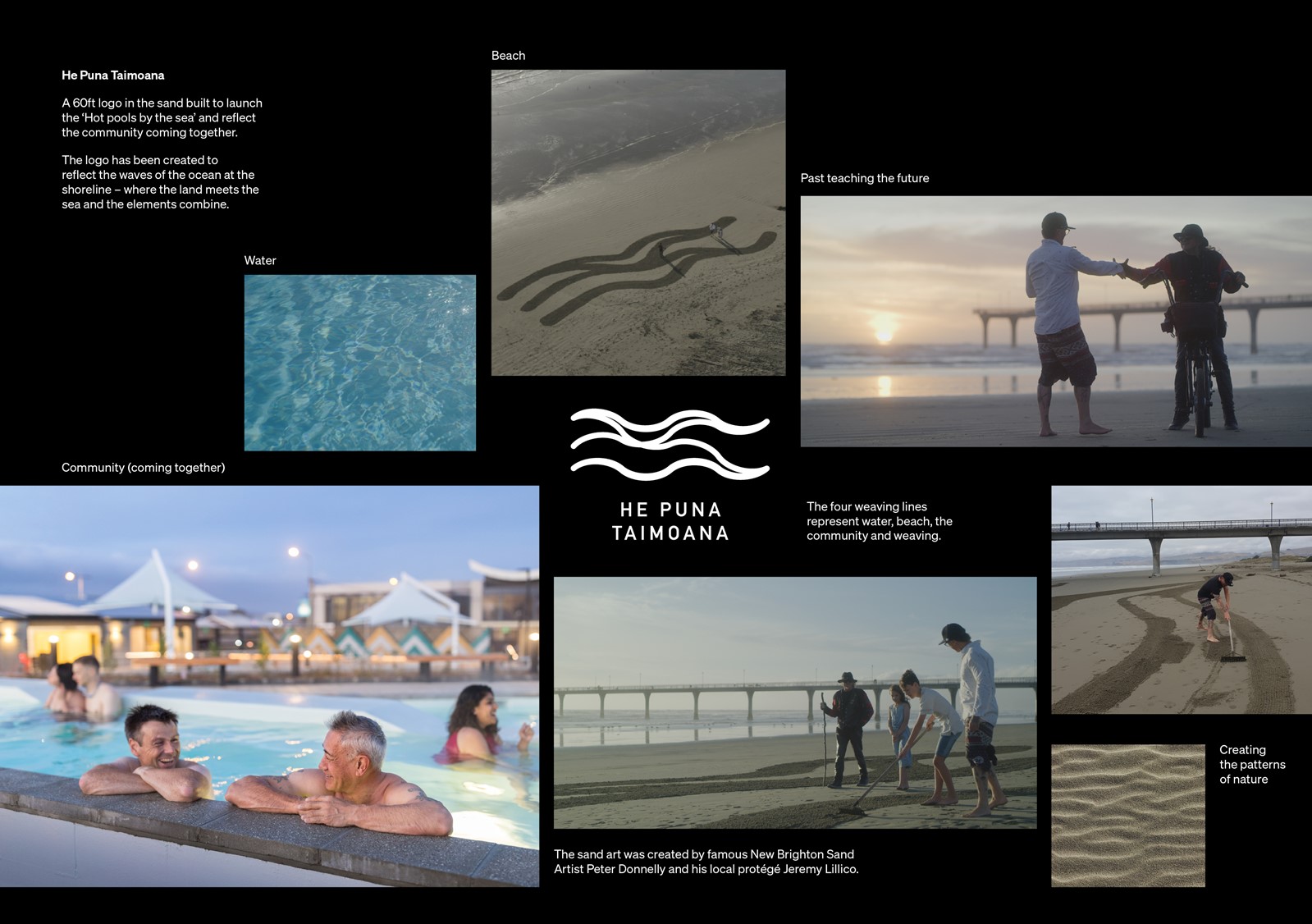
The resulting logo design reflects the waves of the ocean at the shoreline – where the land meets the sea and the elements combine. The four weaving lines represent water, the beach, the community and weaving. A symbol to weave everything together and a visual device we could use to tie the brand together. We didn’t want to overpower the stunning building and location so we weaved it throughout the facility on signage and way-finding and even cut into the rubbish bins.
To further bring the brand narrative to life we created a video which just did just that — told the story of the brand and how the elements combined.
The film stars Peter Donnelly - New Brighton’s iconic sand-artist, now retired - and Jeremy Lillico, another local artist who’s taking the reins from Peter. This story weaves in elements that make up the Hot Pools (people, place and experience intertwining) and threads that with a central narrative of the kid’s encounter with the artists and the community coming together in the pools.
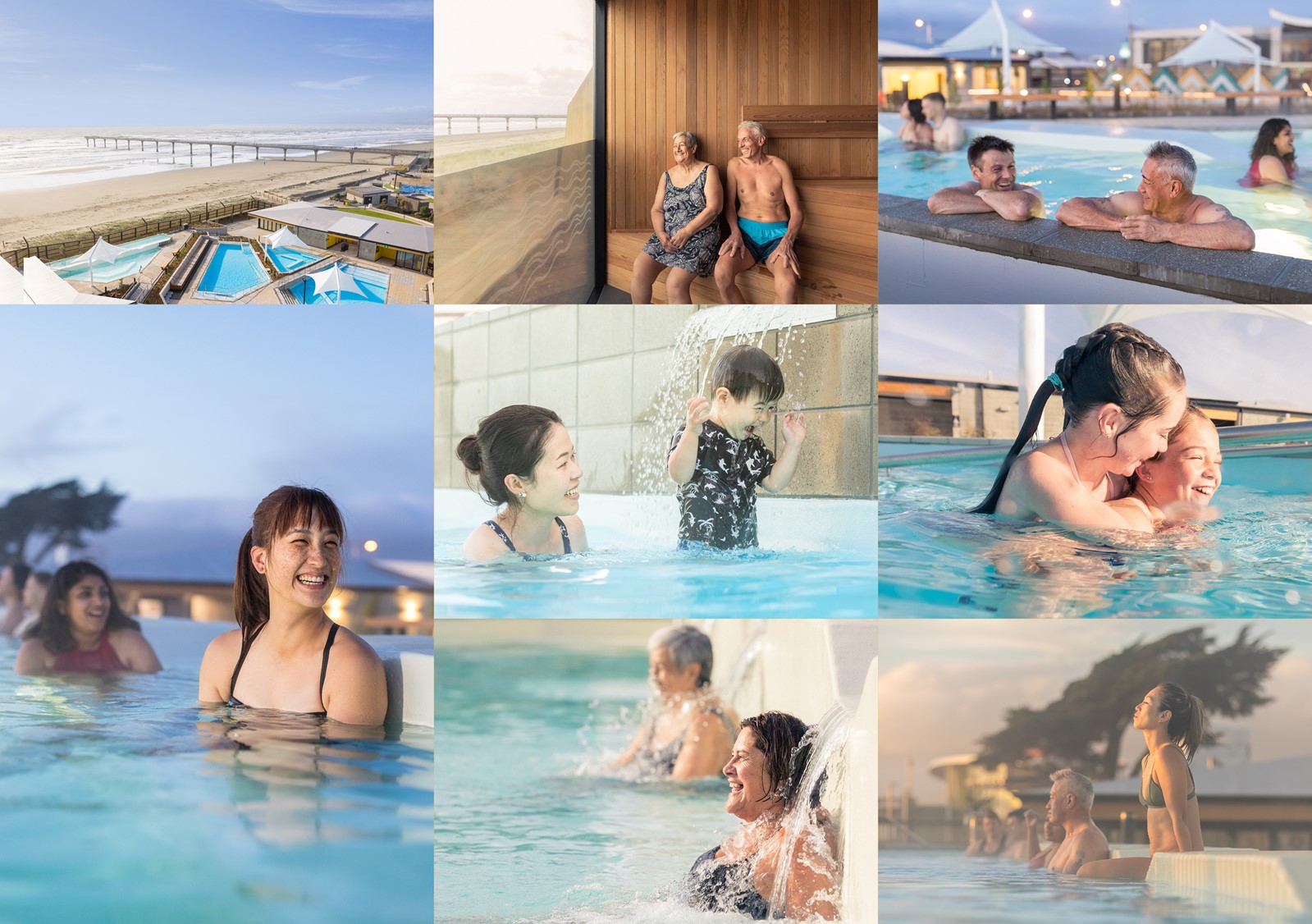
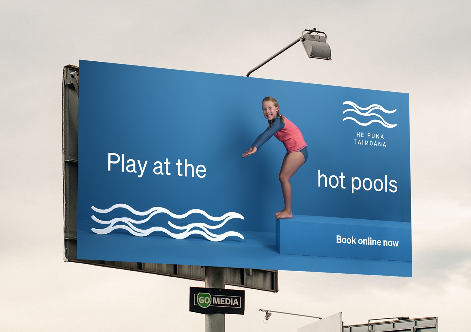
This was complemented with an advertising campaign. For this we wanted to showcase the emotional response that this facility would get from the community. We created a stylised set and key wave motif. We used models that represented our four key demographics. We then chose blues that represented different colours of the water.
Results
In spite of launching post covid, the results have been outstanding:
— The brand narrative video has been viewed over 19,500 times
All sessions for opening (Queen’s Birthday Weekend) were booked and sold out – in 6 hours.
— The website had 213,000 unique visits and the Pools have been sold out for 12 weeks in a row. Because traffic to the website and bookings were so high, the client delayed the online ‘launch’ campaign.
— Visitor target 75,000, result 82,690 visitors
— Website target 1 million, result in 1.5 million page views
— ROI target $5. Actual $29.
